“Hire a designer”. That’s one of the most frequent pieces of advice I give to new startups. Everyone on the team nods approvingly, acknowledging what everyone already knows is true (a large part of advising tech companies is confirming things they already suspect), yet the reality of finding the right person and bringing them on board often ends up getting pushed down the ever-growing shopping list of essential tasks. It’s understandable: building a tech company means rapid iteration, pushing out MVPs and, in all honesty (and above all), putting out endless fires. Hiring that designer becomes a slow burning fire which pales in comparison to the furnace of, say, tomorrow’s board meeting. Yet that slow fire will constantly eat away those customers. Here are some tips for integrating the evolution of your product experience into your development process.
Hire at the Beginning
If you truly believe in the experience as being something that will define your product, make sure that you set the tone before madness commences. Having a designer as a co-founder or early employee will change the whole approach to how your team thinks of the product, and makes it clear that design is key. Designers are also creative people and they like creating babies (I’m speaking metaphorically here), so having them there to actually define the product and take it in new directions will push the whole company several steps higher. Don’t be afraid to approach them with just an idea: creative people love to think about how an idea could manifest, and even a highly experienced person may just want to jump on the opportunity to create something new and world-changing.
Keep in mind that graphic designers are not the same as UX designers, although there can be overlap. I tend to lean slightly towards having people with graphical or artistic design background as I have gathered a fair amount of UX experience myself, and because, to be honest, great design forges great experience (and vice versa). Your situation may be different. I also don’t require designers to be able to code, although understanding and accepting technical limitations is essential.
Once you do have them interested, let them go wild with ideas. Give them a blank slate.
Finding the right person can take time — it is worth taking that effort. You may be able to get by for some time without them on board, and with Usertrace’s Green Lane we are building a service that uses intelligent algorithms to analyse the experience rapidly for you. That should be useful while you search for the perfect person, and will speed things up afterwards as well. However, the sooner you can get that thinking into the team, the better.

Make your whole team understand the importance of experience
After the goals of a new feature or product have been roughly set, the design should lead. It is easy to think that technology can be built completely separately of the design, but frequently it would be too time consuming to develop the technical architecture needed to have complete flexibility from the design. Often corners have to be cut, particularly in the early versions, before it needs to scale. A wireframe can be a good first step, at least if the design is iterative rather than something revolutionary, however I personally would like to take the design a couple of steps further before coding starts. Apple famously utilises pixel perfect designs, and while I don’t think it’s necessary to go that far, frequently the brilliance (or, indeed, the problems) of a design is not obvious until it is fleshed out further.
Run a synchronised, but separate design process
Ideally UX feedback and design tasks should be integrated into the regular agile cycle, but due to the slow nature of gaining human feedback and running design processes, that is generally not feasible and would slow development down. Many companies either run design tasks completely separately, or end up having a disconnect between the design and development. It’s too easy to forget that the development team, in order to do work well, need to understand the rationale behind UX and should participate. At the same time constant interruptions are a nightmare for both sides.
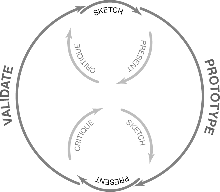
At Solu we ended up running a separate track for design tasks, running through iterations of a new feature until the UX team felt they were on the right track. Then we would bring the whole team together to present the idea. Several times that would lead to us going back to the drawing board, due to technical limitations or simply revealing a previously unnoticed problem. The biggest challenge was knowing when to stay firm with brilliant, innovative designs that could become signature designs for the product, while also being able to say no to a unique design that simply was not working. We did not always get that balance right, but we improved immensely with time.
Another challenge is allowing development teams to move forwards evolving the product and features, without going through the whole UX cycle every time. While that would be optimal for maintaining a great experience, it is something a small, rapid company cannot afford to do. A model I favour is for every other or every third sprint to focus on repairs, rather than new features. Unfortunately, with the excitement of creating a new product, and with tight deadlines looming, it can be difficult to keep to that rigid model, but doing so pays dividends in the long run, and is mentally good for the team. Again, with the Green Lane product we are now developing, that process will be greatly improved as UX is constantly monitored by an AI team member, even for small changes.
Ask difficult questions
The most hated and most loved thing for an ambitious designer — especially one with artistic tendencies — is a critic. A great product owner should have good understanding of the technical nuances, as well as a long background in creating outstanding experiences and a deep love for the sublime. Those people are not easy to find, but they will be the ones asking both sides the difficult questions or pushing towards excellence. What happens when people use the product in unexpected ways? Can a feature be simplified further? Does the user always know how to get back? What if someone’s name is extra long? What if they are disabled?
When doing this it is possible to get bogged down, and to miss the beauty of the forest, so tread carefully. A great product owner will step through the corner cases with a skeptical mind, but also encourage and embrace creative brilliance.


